
What can we learn about graphics, politics and human rights?
Political graphics have long been attached to British and overseas politics, from early twentieth-century suffragette banners to the placards featured in last month’s Campaign Against Anti-Semitism protests at the Labour Party HQ in London. However, whilst they have traditionally been associated with states, corporations and official campaigns, recent years have witnessed the increased ability of the individual to produce and spread such material, notably through social media platforms such as Facebook, Twitter and Instagram. With their prominence amplified by the politically turbulent nature of the past decade, which has seen sub-state terrorism in the West, the rise of populism and worldwide protest movements, political graphics now feature centrally in our lives. In present-day political campaigning and activism, for example, they seem to overshadow knock-on-door techniques and the use of the podium. It is in such a context that an understanding of this phenomenon is particularly important.
Flanked by Shepard Fairey’s “Hope” poster for Barack Obama’s 2008 US presidential campaign and the corresponding Donald Trump “Nope” meme spinoff, the past decade’s political graphics form the subject of the Design Museum’s most recent exhibition “Hope to Nope: Graphics and Politics 2008-18”. The exhibition contains an extensive array of designs, featured on, for example, posters, banknotes, flags, hats and beermats, as well as in the form of memes and videos. Split into three sections (“Power”, “Protest”, and “Personality”), the museum’s basement gallery has been transformed into an urban setting, within which the varying roles of graphics in politics are explored. When considered in relation to human rights, these can be positive. Yet, in some cases they can also be damaging or obstructive.
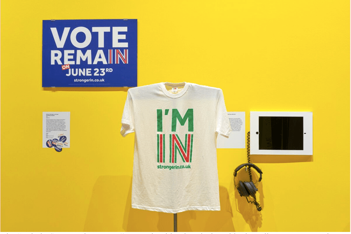
The “Britain Stronger in Europe” campaign identity, designed by branding experts North. Credit: Benjamin Westoby.
Political graphics can serve as powerful tools to assert or subvert power, a theme which is explored in the first room within the exhibition. One such featured example is the 2015 short, animated video “The European Refugee Crisis and Syria Explained”, produced by German YouTube channel and design studio Kurzgesagt – In a Nutshell. Alongside an explanation of the Syria-related causes of the European refugee crisis, the video’s creators promote states’ acceptance of refugees through challenging conservative concerns about Islam, high birth-rates, crime and the collapse of social systems. It is of no surprise that by April 2018, this video had been viewed an impressive 12.1 million times on YouTube. Indeed, the animation is bright and striking, whilst the accompanying verbal narrative is well-structured and clear.
This part of the exhibition also addresses the impact of social media platforms, from which political graphics, such as memes and gifs, can be projected to billions of people around the world. In some ways, these can be understood as democratic instruments: they facilitate access to content for greater numbers of people. As part of the 2017 #MeToo movement, for example, experiences of sexual harassment were shared by 4.7 million people in 12 million Facebook posts on a single day. Nevertheless, social media platforms can also be representative of agents of misinformation. In 2017, it was disclosed that, during the US presidential election of the previous year, an estimated 126 million American people had come into contact with 80,000 posts allegedly produced by 120 fake Russian-backed pages. The exhibition’s curators have reportedly expressed a desire to add additional images of a Russian troll farm, which allegedly produces memes on a mass scale, to this part of the showing.
The subsequent section of the exhibition explores the way in which political graphics are used in public protests to incite change from below, often in relation to basic human rights. Six screens composing the striking “Hope to Nope” film installation stand in one corner of this area. Designed and produced by London-based designer Paul Plowman, this bold piece focuses on five recent public protests: The Women’s March (worldwide), the Grenfell Tower protests (the United Kingdom), the Catalan independence protests (Spain), the Gezi Park protests (Turkey) and the Jacob Zuma protests (South Africa). Featuring social media hashtags and messages, footage and images, it grants the viewer insight into the diverse ways people protest and the variety of emotions on show as such activity takes place.

The “Hope to Nope” film installation, designed and produced by Paul Plowman. Credit: Edward Beales.
From the examples on display in this room, it is clear that many political graphics used in public protests are consciously crafted with social media in mind. For example, English is often included in designs in non-English speaking countries, in what is likely an effort to broaden global support for advocated causes. Another interesting phenomenon is the use of political graphics in more passive forms of public protest, such as the Occupy George movement. In this case, red infographics have been marked on to bank notes, which have then been returned to circulation. The infographics raise various issues, such as rising income inequality, as part of a wider effort to highlight the dominance over world wealth by the richest “1%”.
In the last room of the exhibition, the ways in which political graphics can positively and negatively shape public perceptions of prominent politicians are examined. Jeremy Corbyn, who faced much criticism from the British media after being elected as UK Labour party leader, saw his image somewhat revitalised both in the run up to and after the 2017 general election. Indeed, Corbyn-themed merchandise (including the Nike swoosh Corbyn T-shirt, the Jeremoji range of emojis, The Corbyn Comic Book and the CorbynRun computer game, proved to be youth and social media-friendly. The ensuing wave of support for Corbyn should be attributed in part to such clever designs.

The Nike swoosh Corbyn T-shirt, designed by Bristol Streetwear. Credit: Benjamin Westoby.
Nonetheless, political graphics can also help to shape the culture of “fake news” surrounding certain leaders. In 2017, The Washington Post disclosed that a TIME magazine cover, on show in a number of Donald Trump’s golf clubs and featuring the man himself, had been forged. In spite of Trump’s assertions that he is in a “running war” with the media, this scheme seems to represent an acknowledgement of the power of political graphics in the media, as well as an effort to promote Trump as a more prominent figure than he already is. It is a prime example of the way in which political graphics can manipulate leaders’ images to build or change their identities.

Magazine cover caricatures of Donald Trump. Credit: Benjamin Westoby.
In an interview with The London Evening Standard, Design Museum curator Margaret Cubbage states that although the exhibition’s title “could be interpreted as negative”, she thinks that “‘hope’ is obviously optimistic and ‘nope’ is actually more active and is a word that is used to resist or take change.” In light of this, she expresses a personal desire for people to feel “[e]mpowered and aware” upon leaving this exhibition. Furthermore, besides the persisting idea that the Internet is facilitating the ability of ordinary people to create and engage with visual images, the special attention drawn here to the democratic, but also divisive and destabilising, powers of political graphics should be emphasised.
“Hope to Nope: Graphics and Politics 2008-18” is on display at London’s Design Museum between 28 March and 12 August 2018.
